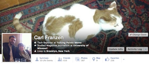
Everyone has been getting used to Facebook's new look, the Timeline. Now, we might have another update on our hands. Go ahead and say it, "Sweet heavens!!" That's what we're thinking. Here is what the current Facebook looks like:
Here is a view of the new Timeline look Facebook has been working on:
What's changed?
"The new look creates subtle but noticeable changes to the top of user profiles, chiefly moving the user’s name, home location, occupation, education, and other basic information into a layer of text atop the “cover photo,” the widescreen image that serves as the backdrop for a user’s profile. The text has been changed to white to stand out against the dark colors of a user’s cover photo
The new view also adds a whole new tab on a user’s profile, the “Summary,” which when clicked, shows a list of the major “Life Events” of the user. The “Likes” section of a user’s profile has been changed to read “Favorites.” The new test also condenses current tabs, including the “Friends,” “Photos,” “Map,” and new “Favorites,” into a smaller space just below the cover photo, making for a more streamlined design.
Facebook declined to specify how many user profiles the new test would involve, as well as whether the new look would eventually be the standard for the website. "
via | via


No comments:
Post a Comment